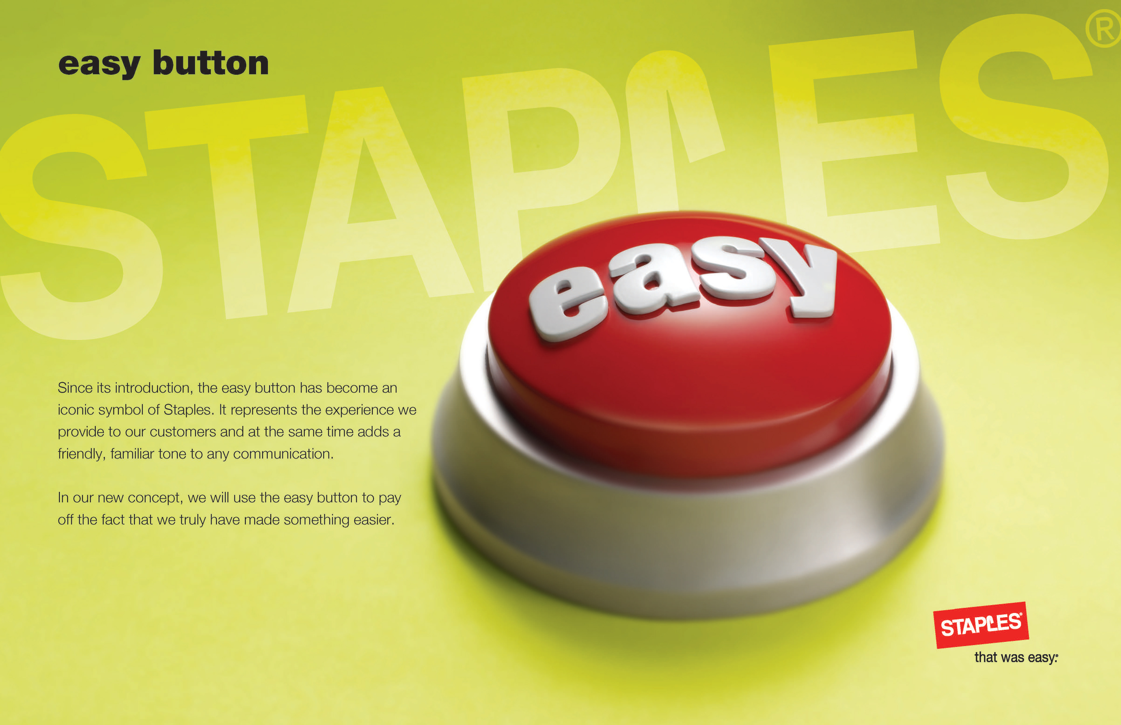
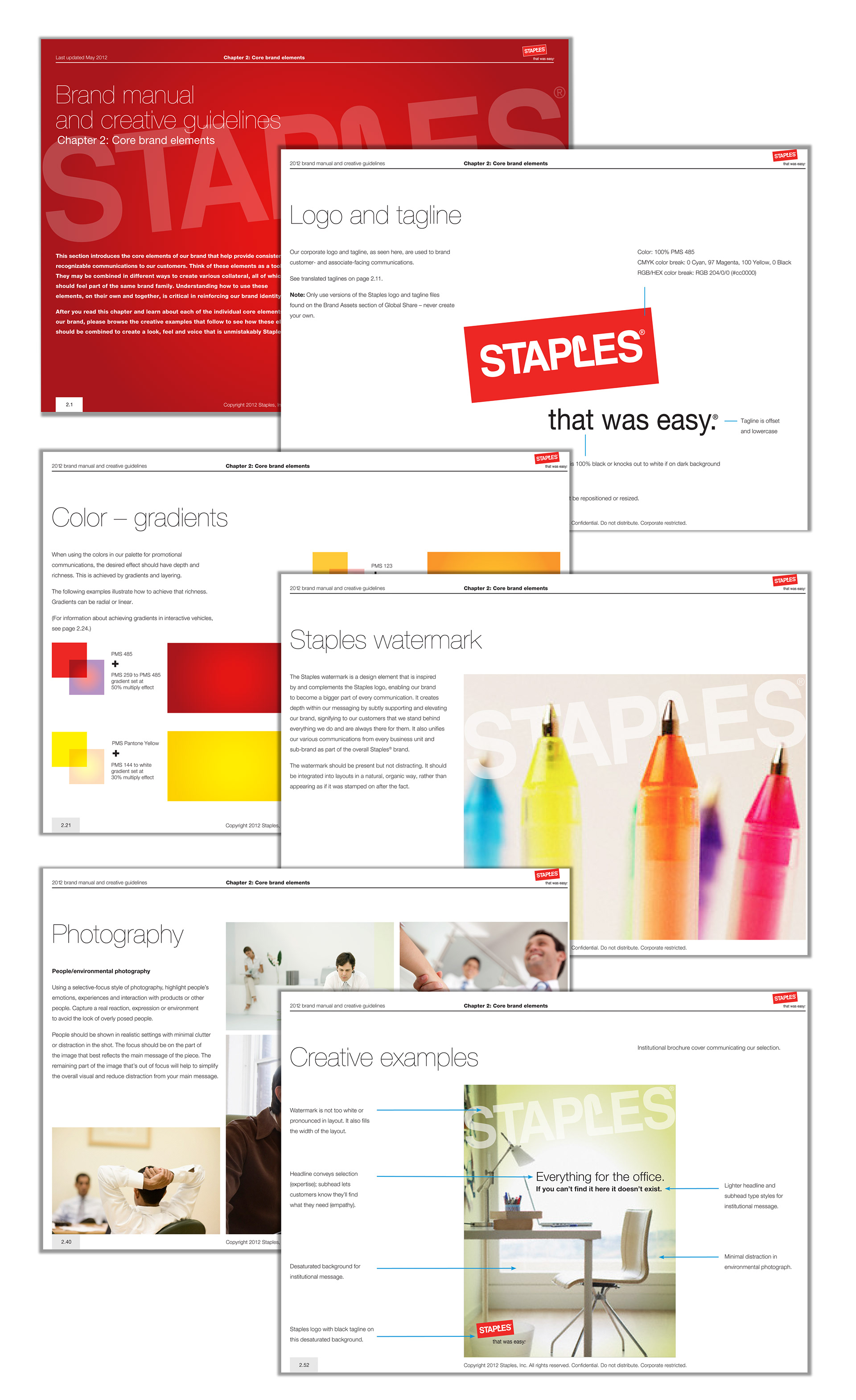
In 2011, Staples had a desire to refresh the brand across all Staples properties. The challenge was how to refresh a brand while maintaining the company's most valuable and recognizable assets — the logo and the easy button.
With Easy the our guiding principle, I looked for ways to drive the brand towards an “authority” position in specific, more service-oriented, businesses.
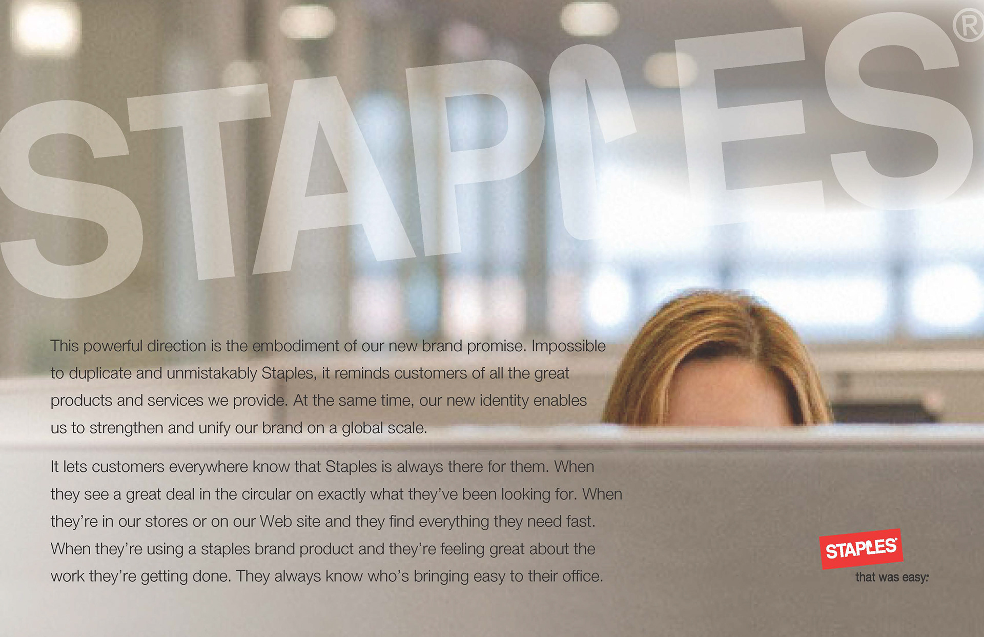
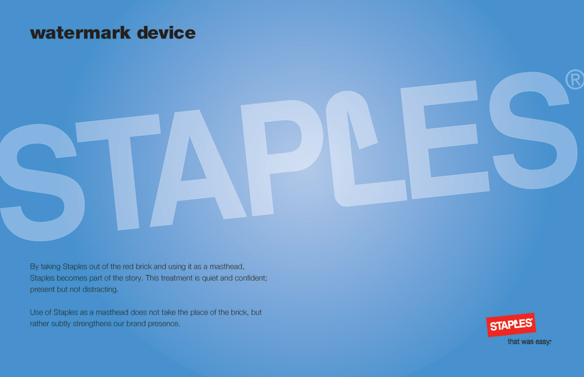
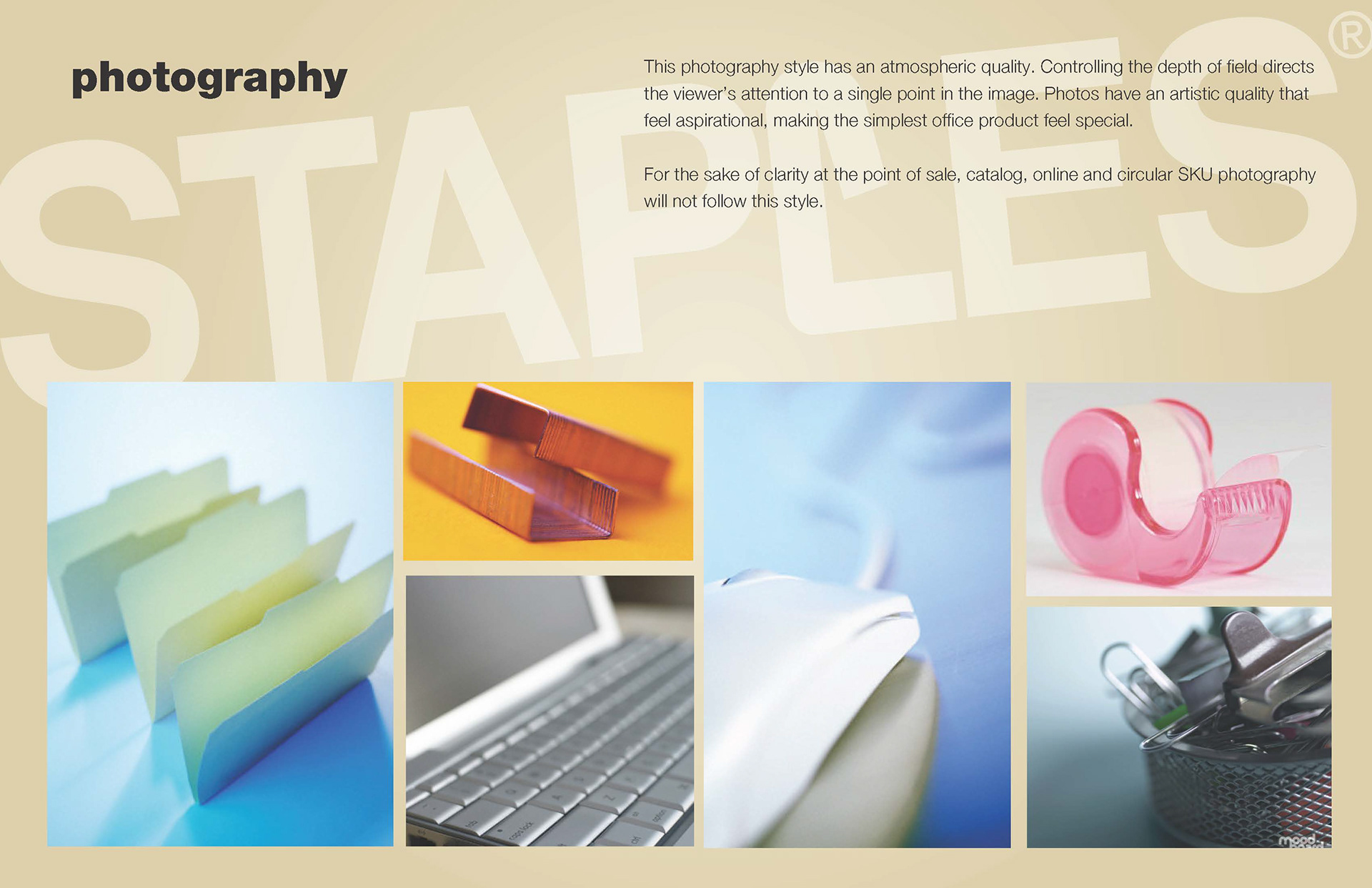
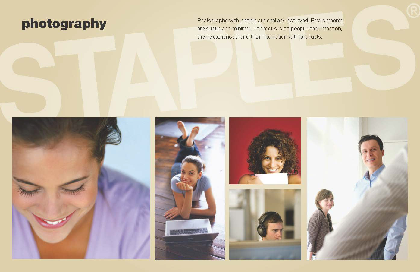
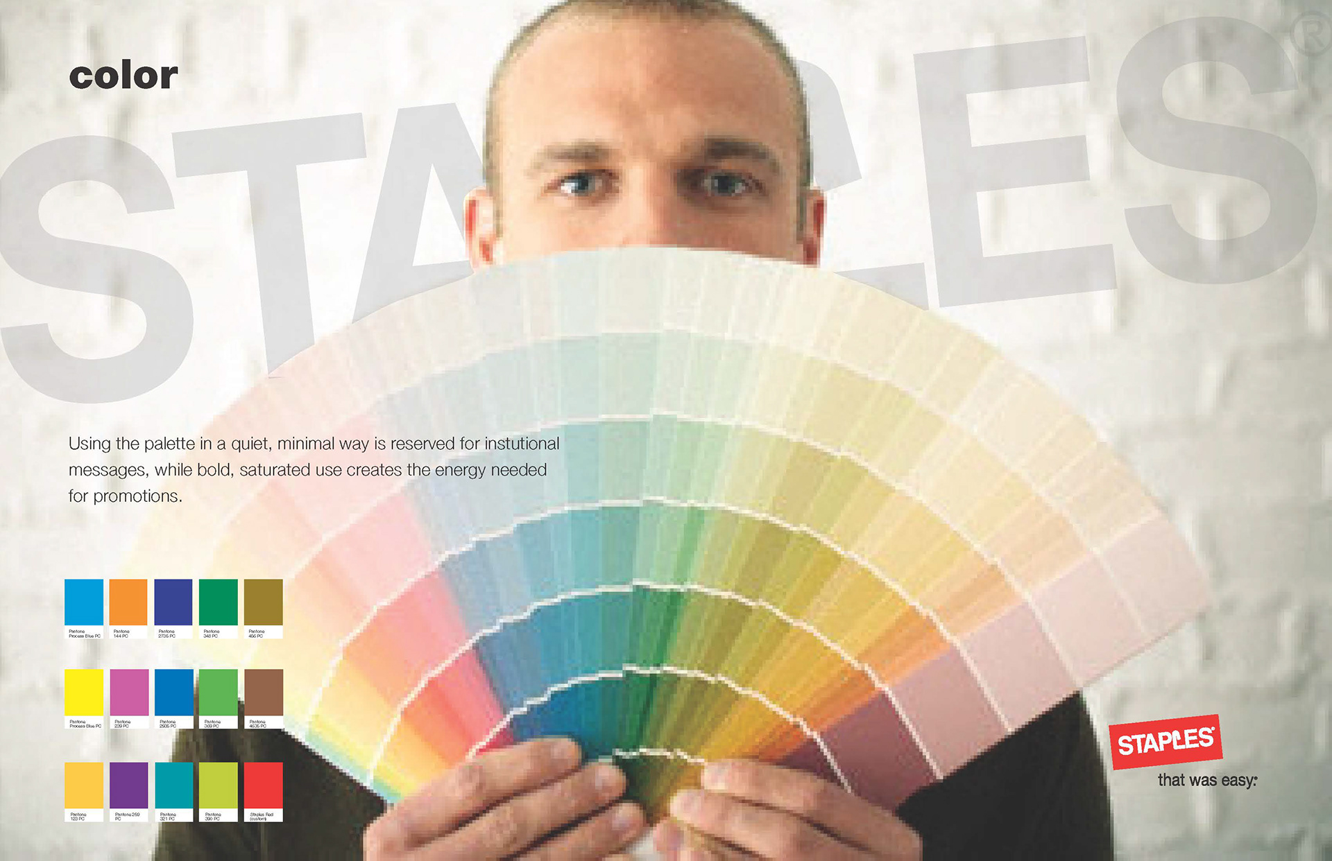
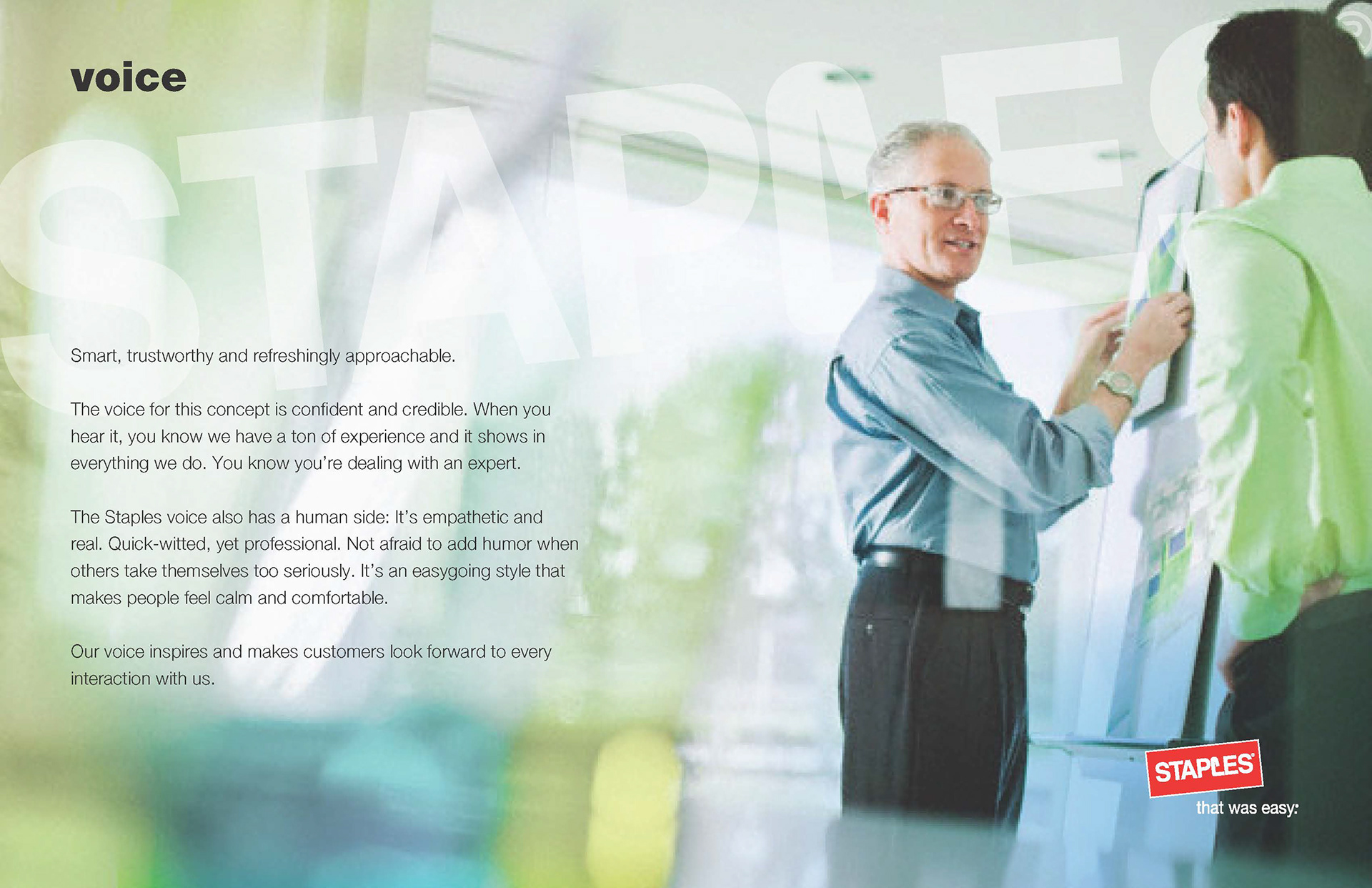
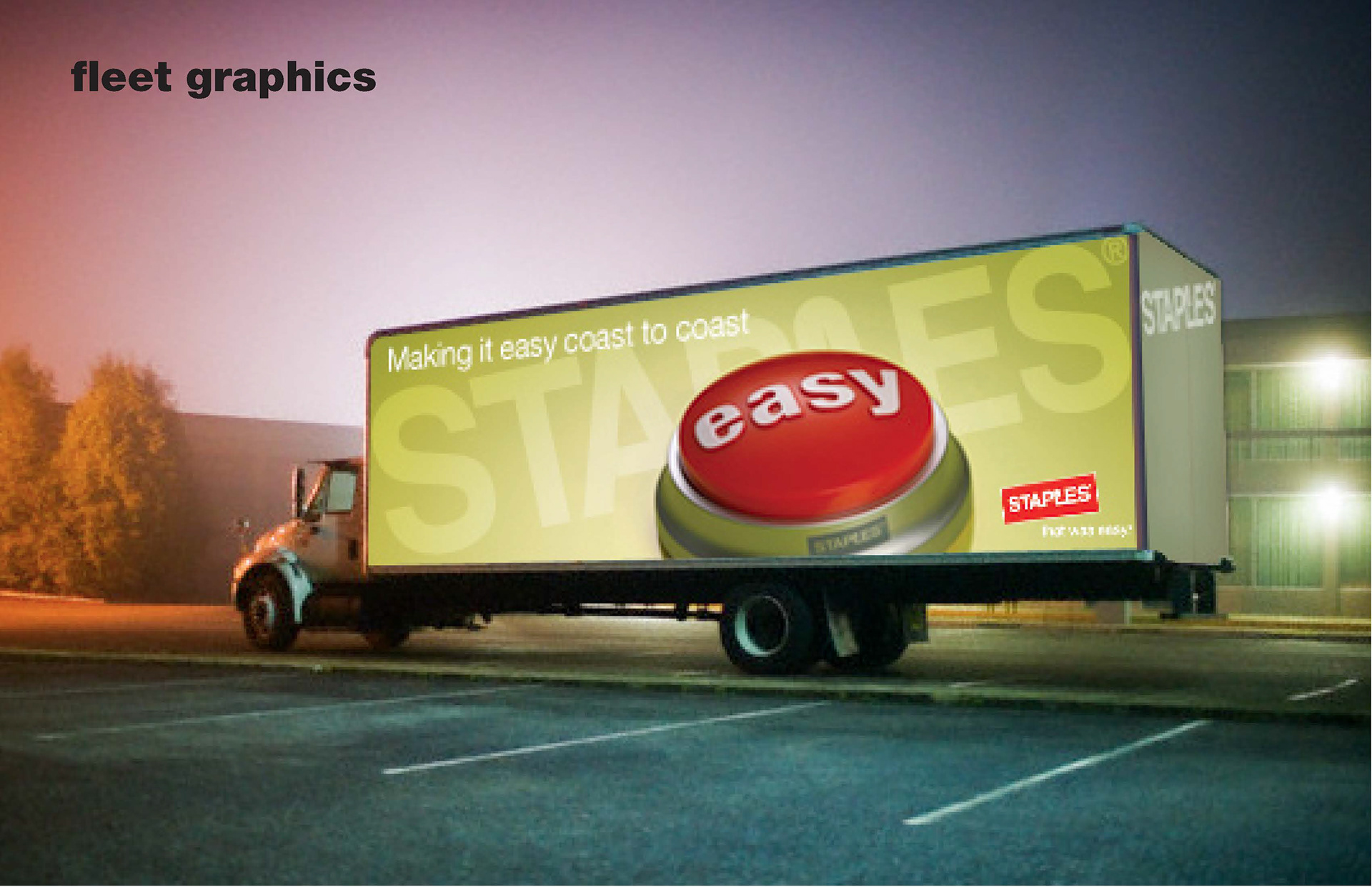
Core elements of the brand, such as the logo, photography style, color, and voice were further defined to reinforce the new direction for Staples.
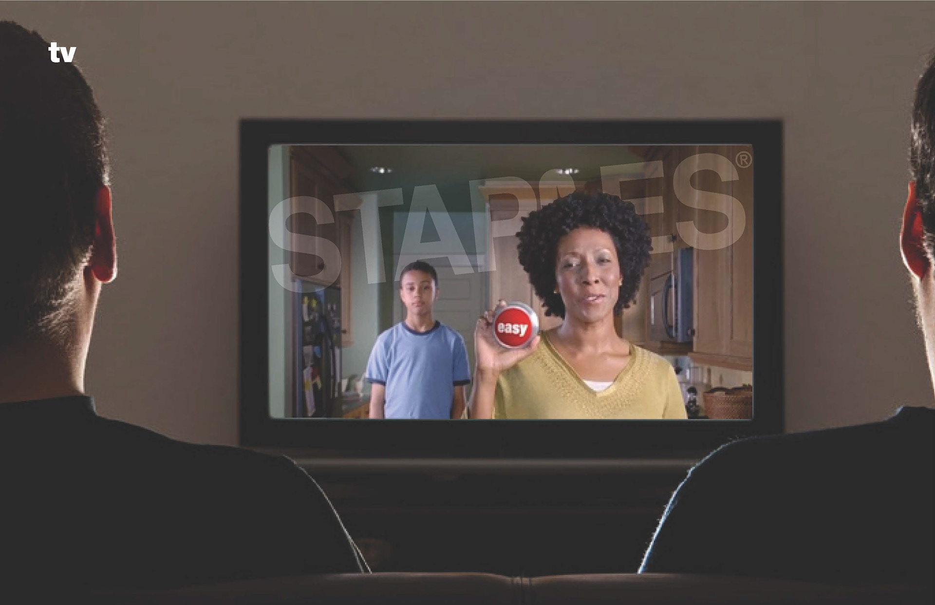
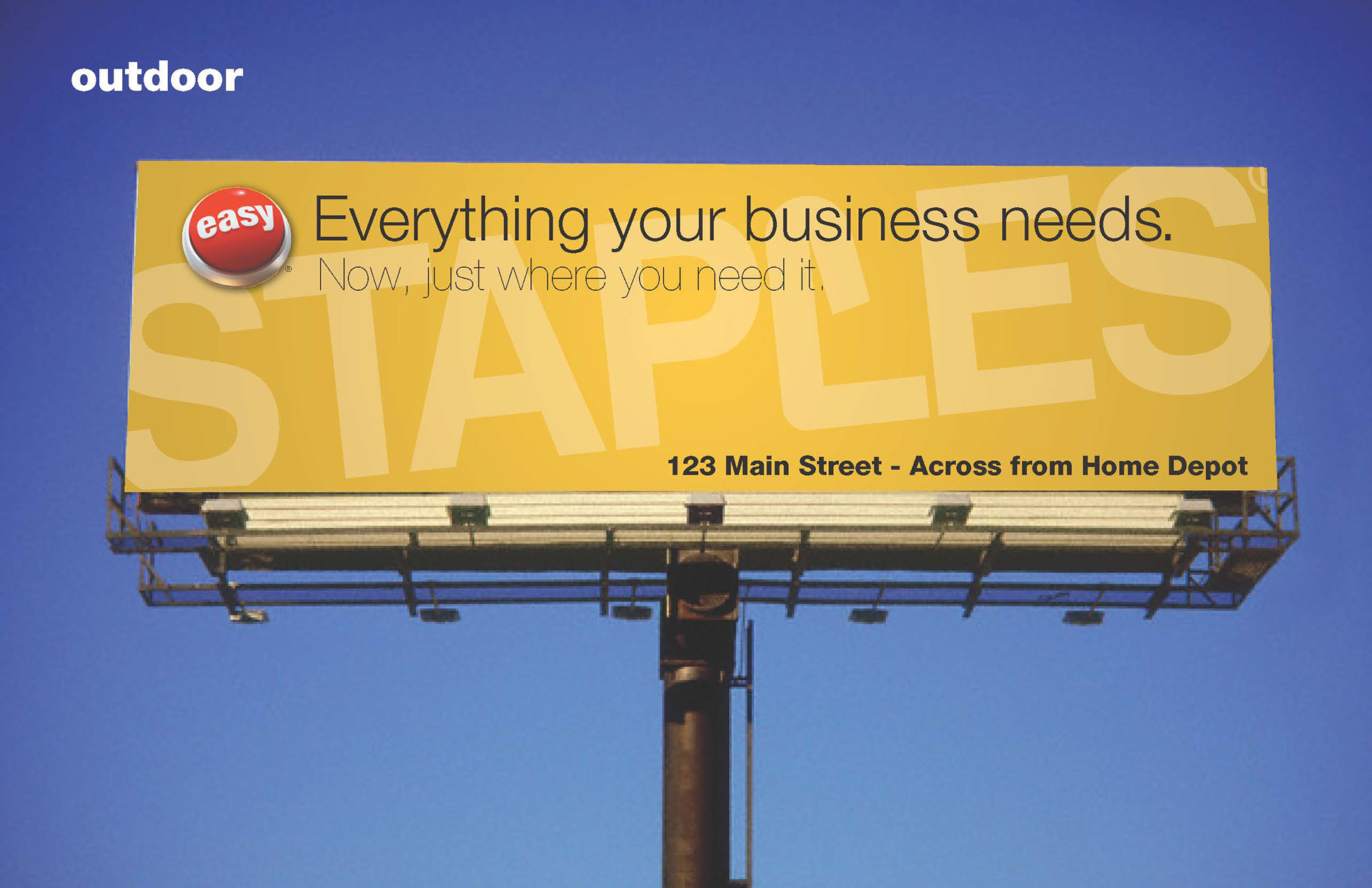
Effort was made to dive into every aspect of how we were marketing to customers and test that the new brand direction would be consistent and effective.
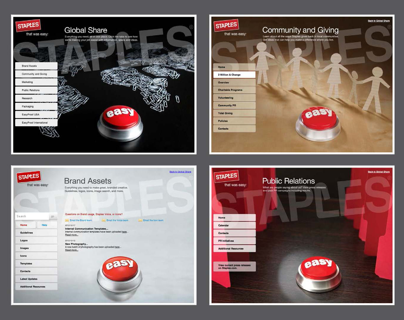
An extensive set of brand guidelines were created for Staples Global brand.
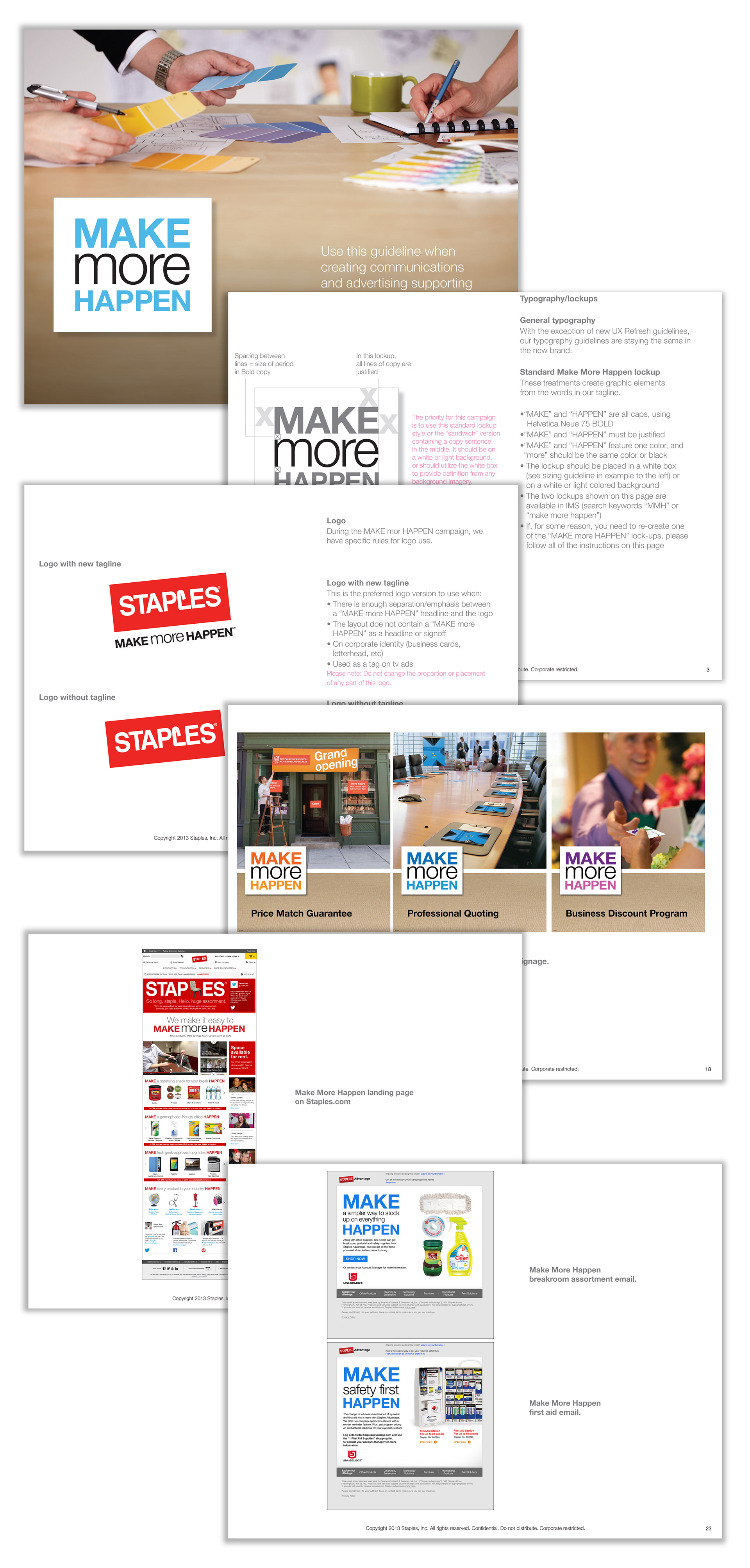
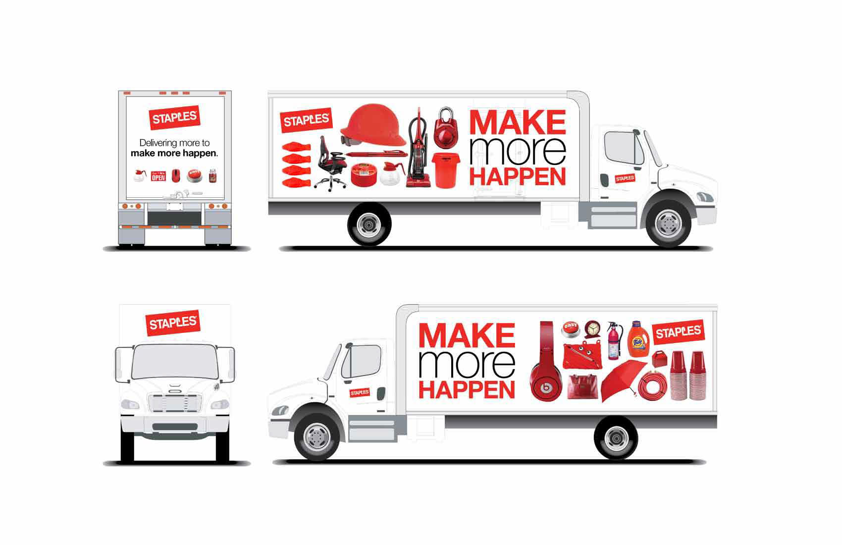
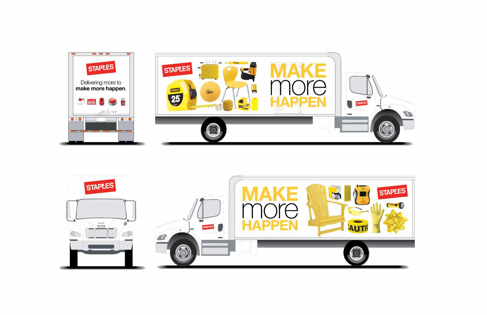
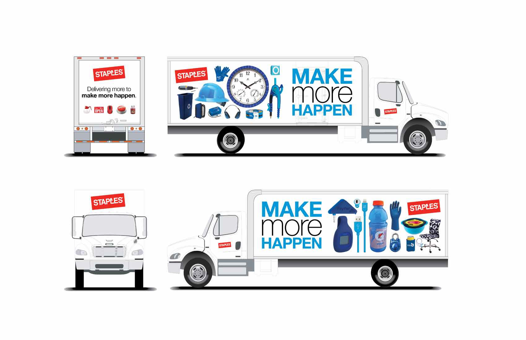
In 2013, the brand evolved yet again. This time, the emphasis was on "more" of what Staples could do for it's customers. A new tagline was introduced, and new guidelines were developed to define the new brand direction.